
Smart, Simple, Helpful Banking
In 2018 our personal banking customers were fed up with the app – had an abysmal 1.6 stars in the app stores. I was tasked with leading the design efforts for two completely new native experiences (iOS and Android) while focusing on a singular goal: fix the basics.
The result? App store ratings increased from 1.6 stars to 4.5 stars and mobile engagement increased from 31% to 44%.
Project Summary
ATB is a financial institution servicing Albertans with over 800K personal & business banking customers (including 200K mobile app users).
Roles: Program Lead (UX), Individual Contributor Team Size: 20+ (Design, QA, Product, Technology) Timeline: 18 months
What People Are Saying
“This update looks so easy to work with and feels more modern than ever before.”
— App Store Rating
“I enjoy the ease of using the app. Very user friendly and easy to navigate through and monitor your accounts.”
— App Store Rating

A Legacy of Issues
The legacy app’s poor ratings were largely attributed to:
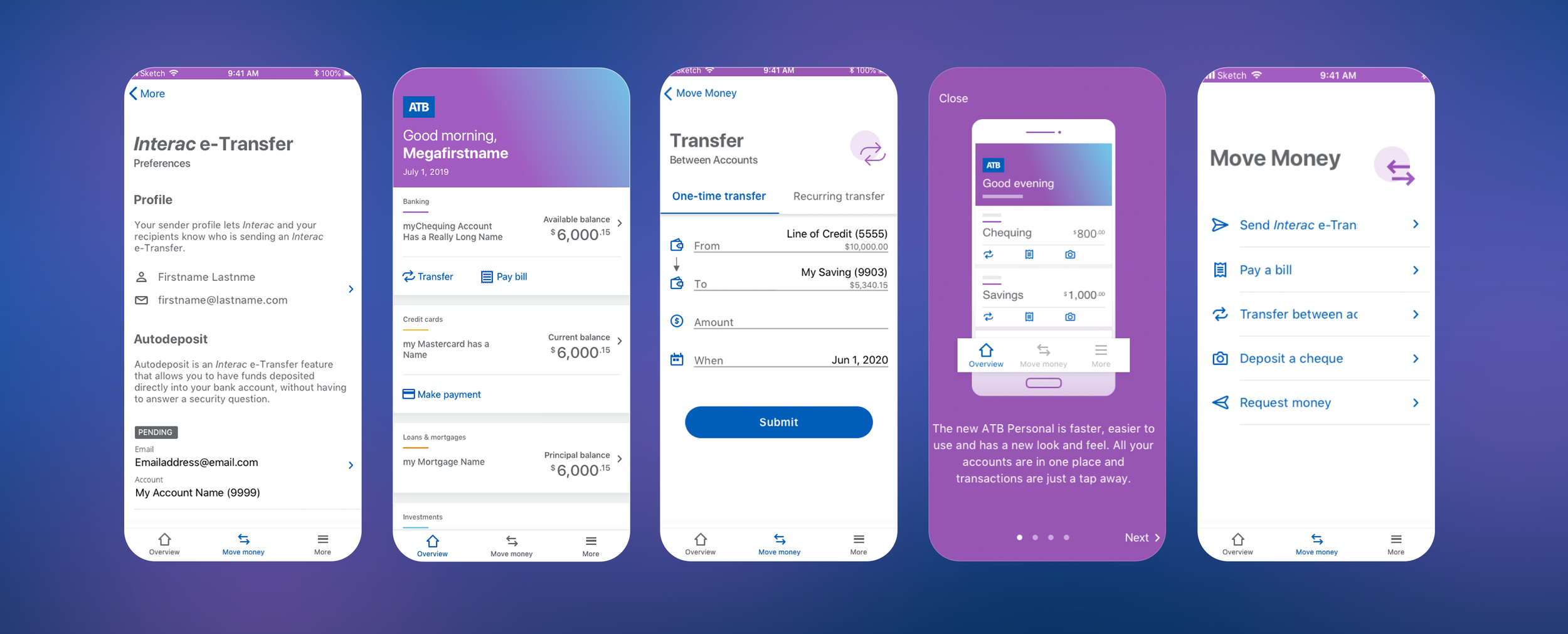
performance - the universal app in a web wrapper was cumbersome, slow and buggy
unintuitive design - lacked clear navigation with primary actions obfuscated beneath a floating action button that was often misinterpreted
Discovery
Contextual Interviews
Conducted by our Research team, these helped refine the vision and approach.
Treejack & Concept Testing
A treejack study helped us refine the information architecture while we brought in existing customers for some concept testing on an early homescreen iteration.
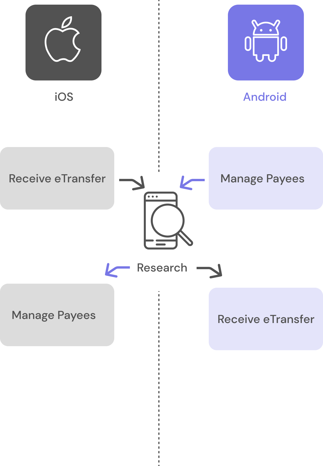
Structuring The Work: Leveraging Cross-Platform Insights
Our first delivery to the organization was within the first 3 months of development so to increase our design efficiency I set up some constraints:
design would adhere to HIG and Material guidelines to expedite decisions
we would dedicate 1 designer to Android and one to iOS (I would float between platforms), allowing us to tackle two problems simultaneously
Research would test each solution concurrently with those insights being applied to the other platform in a rapid design cycle
Practicing Inclusive Design
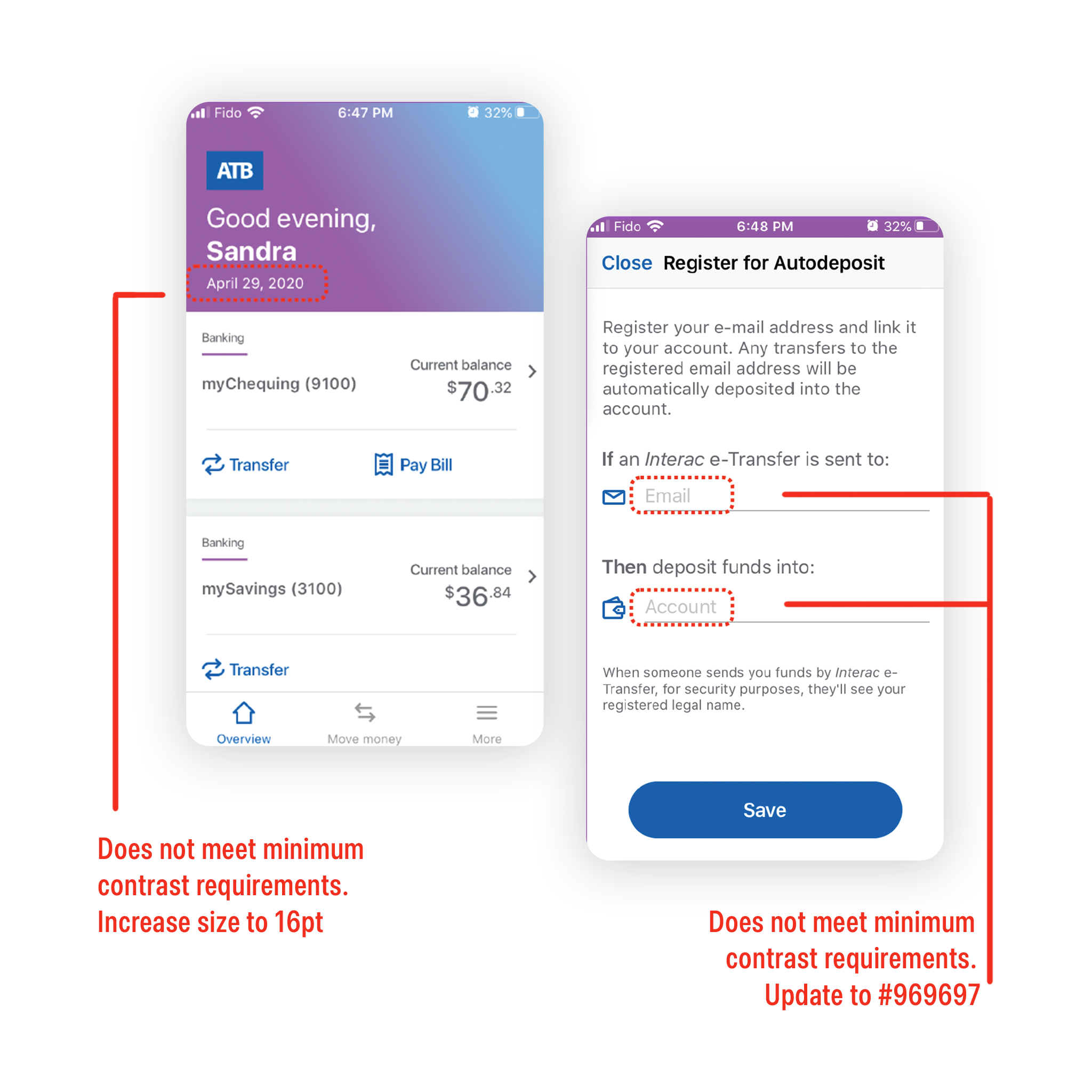
Another benefit of native app builds are all the accessibility benefits that the platform offers. We had defined inclusivity as a pillar of our approach and to achieve this, I:
used tools to identify violations (accessibility inspector & accessibility scanner)
prioritized issues based on WCAG’s AA ratings and worked with other leads to identify fixes
Web Is Born
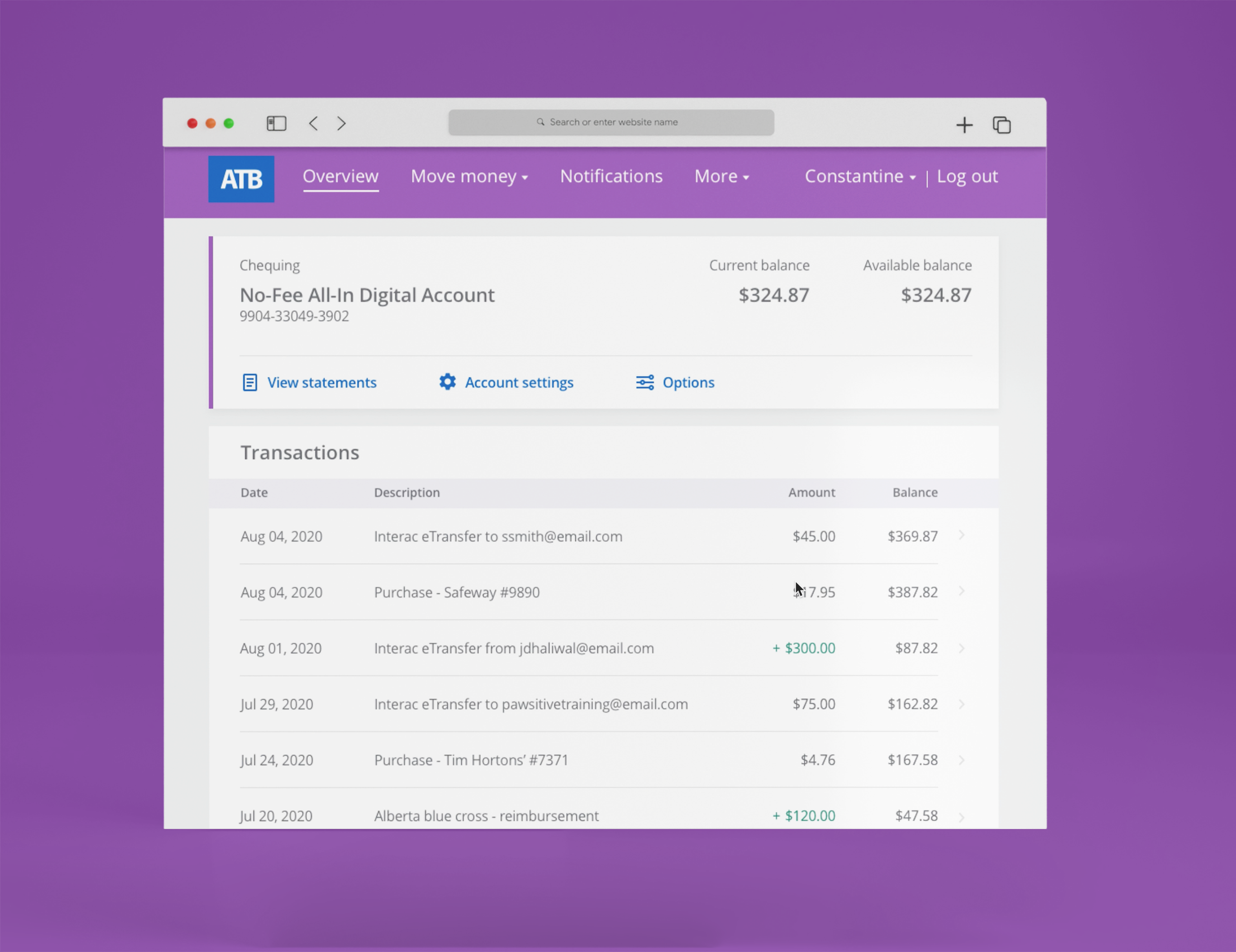
After 6 months of design & development work on the mobile apps, the web redesign project kicked off, doubling our design team. As a result, I had to:
increase efforts to ensure consistency with weekly touchpoints that included all designers & researchers
ensure that any research findings were communicated to all designers to ensure applicable findings were implemented
develop a cross-platform strategy centred on continuity & consistency, accounting for handoff between platforms
In addition to measuring mobile engagement & app store reviews, the overall success of the Personal Banking re-platforming can be measured by:
Reduction in call centre volumes
Forgot password was a top driver
System Usability Scale (SUS)
Reduced time on task for key actions such as: transfers, bill pays, payee management
